1. Larger Images
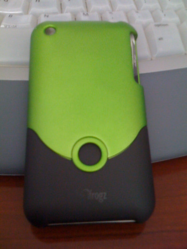
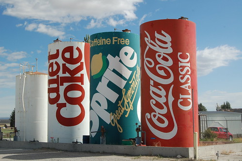
Photo sharing services typically compress or shrink photos you upload to save space, but I really like the bigger cleaner crisper version of the new Flickr interface.
2. Better Navigation
I really like that you can now find all the features in a drop menu right above the images. Before I was always hunting for what I wanted to do.
3. Zoom
There is a handy Zoom button right above the image now, which takes you to a lightbox version, with the ability to see multiple sizes.
4. Improved Thumbnail Slider
In the old version of Flicker, you could only see two thumbnails, previous and next, and it was very clunky. The new thumbnail slider let's you see 5 images, and in fact slides back and forth without reloading the page.
5. Geo Tagging
Geo tagging is all the rage, but I really like being able to see where a picture was taken. Sometimes I want to go see the places people have taken pictures, but without having to email and ask, I can find the location right on the map.
Over all this is a huge upgrade for Flickr. Now, if Yahoo!/Flickr would just step into 2010 and add real social network sharing, they would have a killer service, one that would rival TwitPic or Posterous.
My Flickr photos.

